Mappedin Directory
Rebuilding the digital directory experience for new venue types
Senior Product Designer
Canadian product & visual designer with 10 years of experience spanning scalable systems and multimedia storytelling. I'm happiest when I'm sweating the visual details.
Currently at Mappedin, designing how people navigate indoor spaces.
Mappedin Directory
Mappedin Web

Mappedin
Alert Labs
Motion study
My background in film, video editing, and motion graphics heavily influences my work today, allowing me to bring a cinematic lens to product prototyping.
Lately, I've been leaning further into the technical side of design — shipping small front-end changes, working with AI tools, and prototyping directly in the browser. Animation and motion are where I feel most creative (click the cherry).
In my free time, I enjoy playing pickleball, watching obscure movies, and researching my next investment opportunity.
Lead Designer • 2022 – 2023
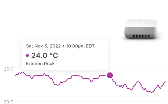
When I joined Alert Labs, the product was at an inflection point. The platform had been built for homeowners with a handful of water sensors, but the company had pivoted to enterprise customers — insurance companies, MDUs, construction sites — managing thousands of sensors across hundreds of properties. The existing platform was slow, built on aging Angular, and designed around assumptions that no longer held for the customers now driving the business.
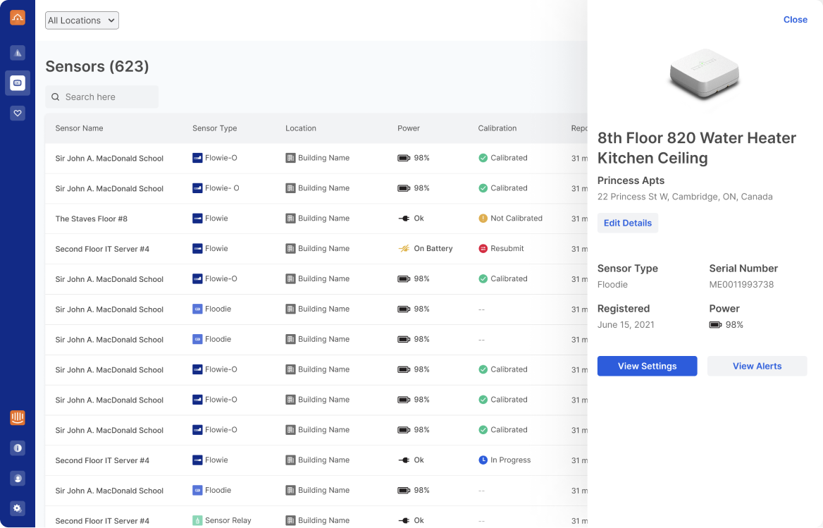
My job was to lead the design of a new platform — across web, iOS, and Android — built for how enterprise customers actually worked. This is one example of that work: the Sensors page, the most-used and most-broken part of the old platform.
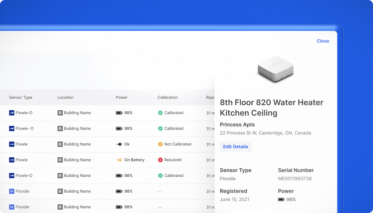
I ran interviews with our largest enterprise customers and our internal support team to understand how the page was actually being used day-to-day. The most useful tool in this phase was customer emulation, which let me log into the platform as any customer and see exactly what they saw. Loading a larger customer's account with 600+ sensors was a very different experience than using a demo account with twelve.
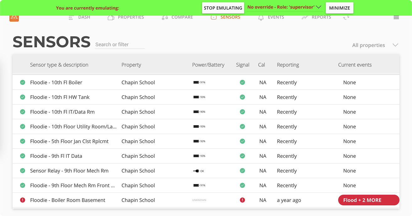
A few things became clear: customers came to this page primarily to check operational health and calibration — not to manage individual sensors. Page loading and errors were the #1 pain point, especially for customers with the most sensors. And long sensor names got truncated, which was a real problem when many shared similar prefixes.
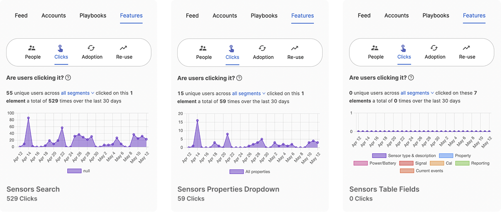
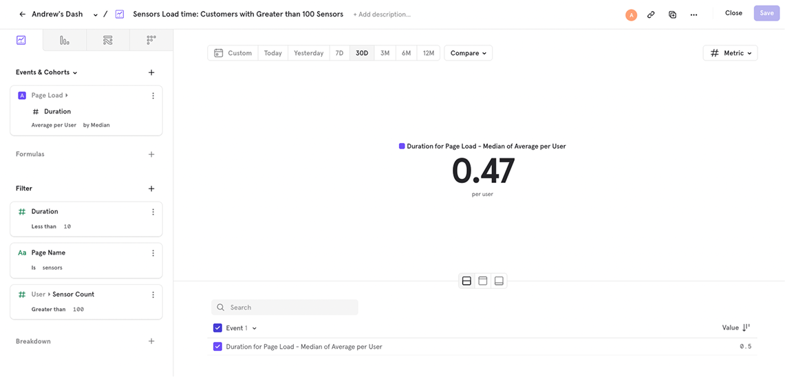
I started with looking at where customers were actually clicking on the existing page. The results showed that the sensor table fields themselves had zero clicks over 30 days. Customers weren't interacting with the table — they were just trying to get it to load.
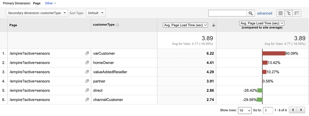
Digging further, the average page load was above 4 seconds. However, for our largest customers with the most sensors, it was 60% worse than that — averaging above 6 seconds. The product was objectively worst for the customers who mattered most.
This changed how I prioritized the redesign. Performance wasn't an engineering concern to hand off — it was the core issue.
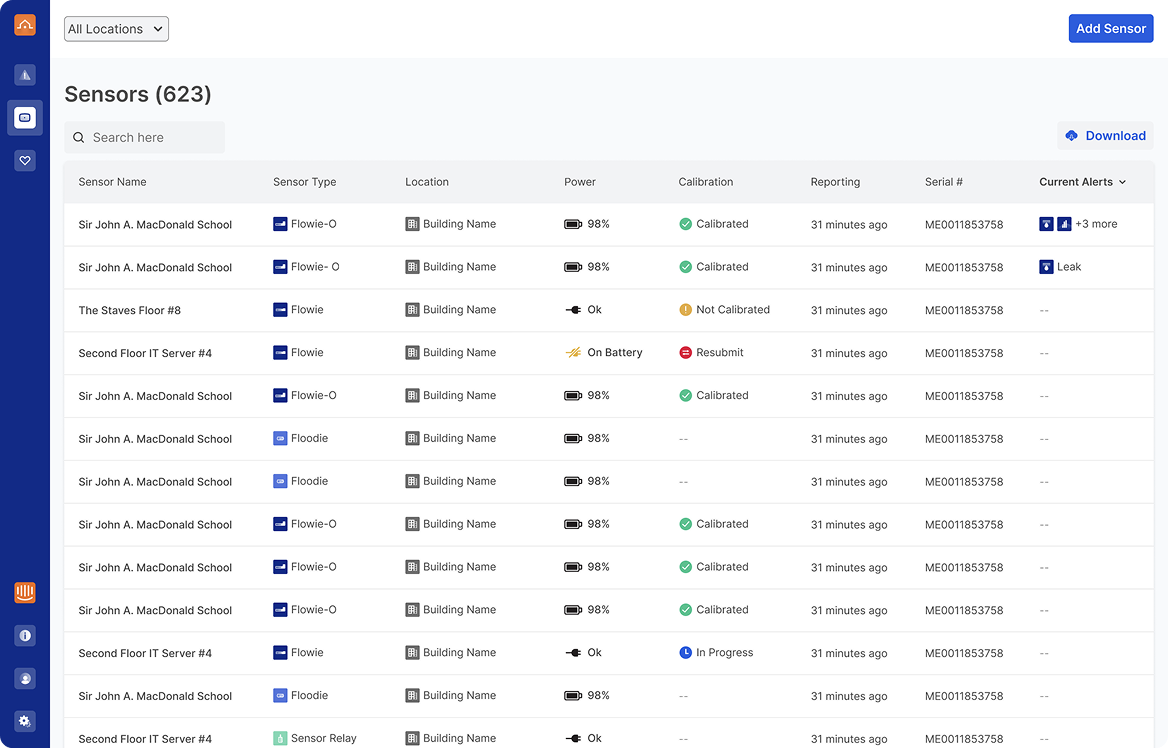
The new page was focused on three things: load fast, surface operational health at a glance, and scale to thousands of rows without breaking down.
A few decisions worth calling out:
Every component on the page was built to be reused. The icons, indicators, table patterns, and empty states all went into a shared design system that powered the rest of the platform rebuild across web and mobile — which is how we were able to ship the full redesign at the pace we did.
Post-launch, median page load time for the Sensors page dropped to 0.47 seconds per user — down from 4.77s.
Beyond the number, the feedback from our largest customers was the real signal. Alerts surfaced quickly, operational health was visible at a glance, and the new naming convention meant they could finally find the sensor they needed.
Senior Product Designer • 2024 – Present
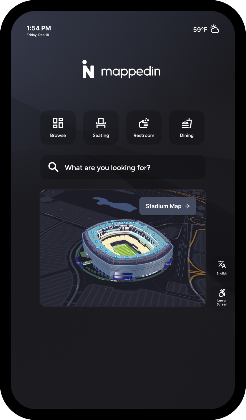
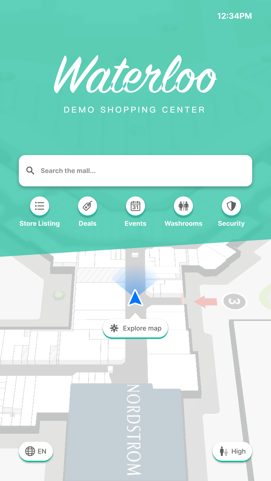
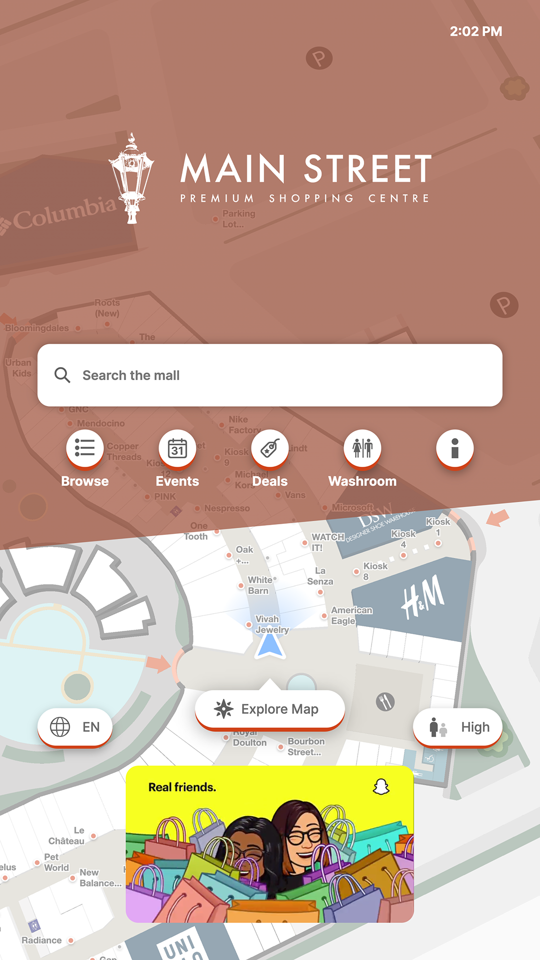
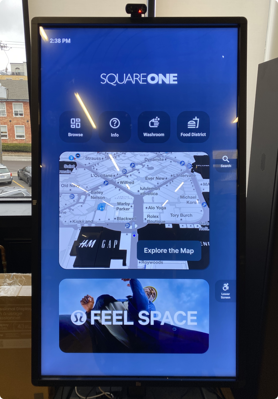
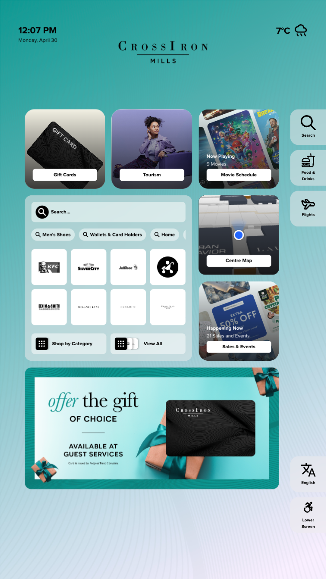
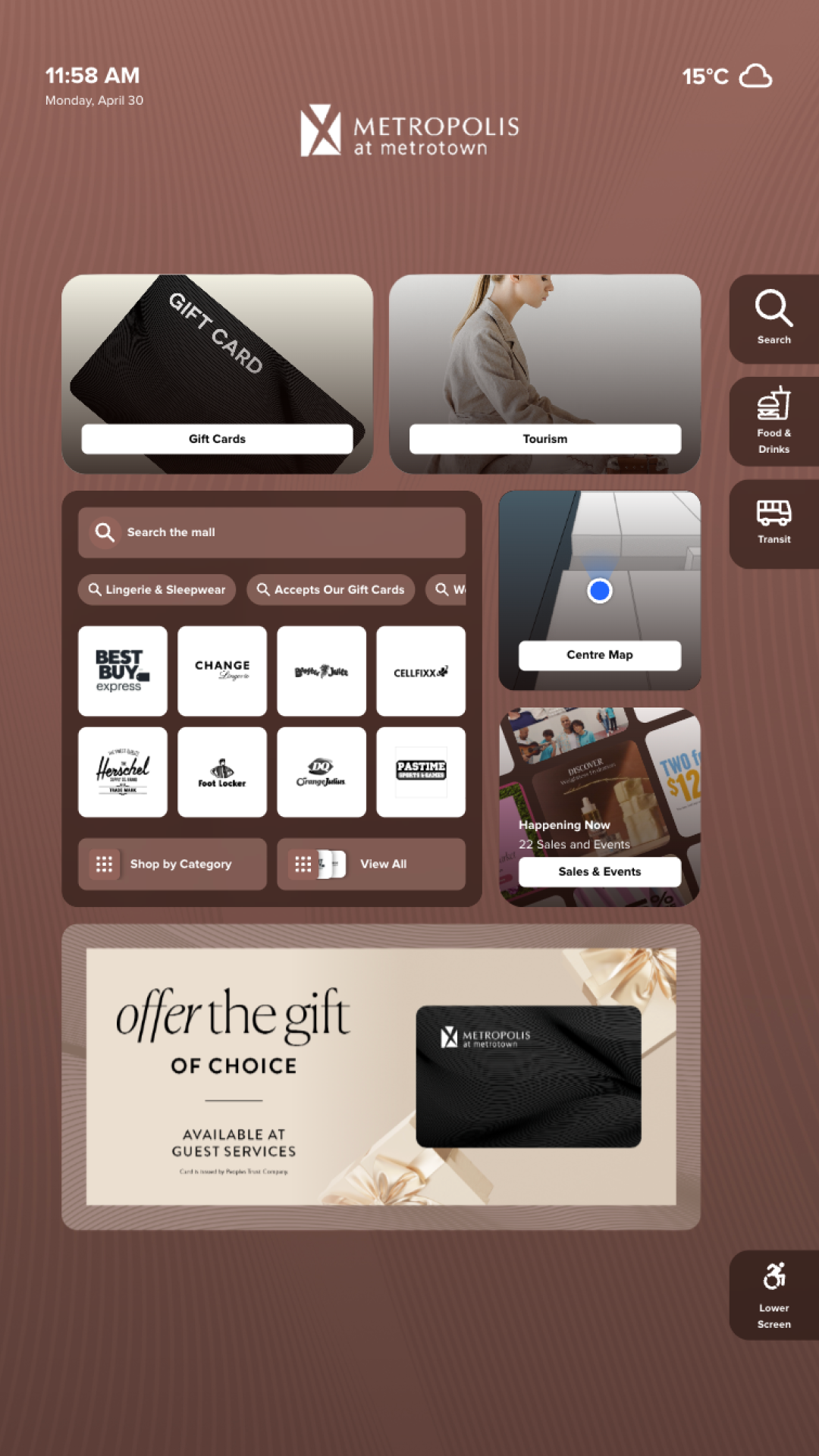
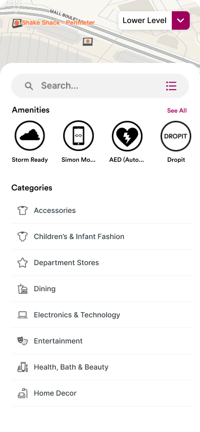
Mappedin Directory is a touchscreen digital signage product that helps visitors search, discover, and navigate indoor venues like malls, airports, and stadiums. For a long time, it was a fixed experience: the same layout, the same components, the same structure for every customer. For standard deployments this worked fine. But as Mappedin expanded into more complex venue types and premium clients started asking for more, the limitations became clear.
Premium venues wanted custom backgrounds, different data sources — movie listings, weather feeds, live events, transit schedules — and layouts tailored to their brand and visitor needs. The result was fully bespoke design work for each client: time-intensive, hard to maintain, and impossible to scale.
The challenge: give customers real flexibility without turning every deployment into a custom project.
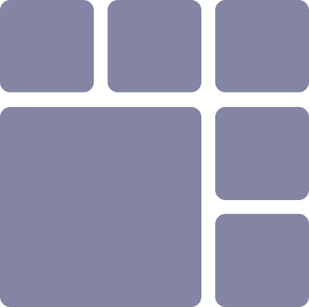
The original directory was a single, fixed layout shared across all customers. While functional, it offered limited flexibility for venues with different needs and little room for promotional or branded content.
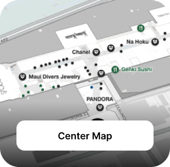
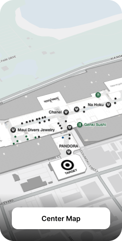
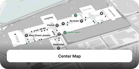
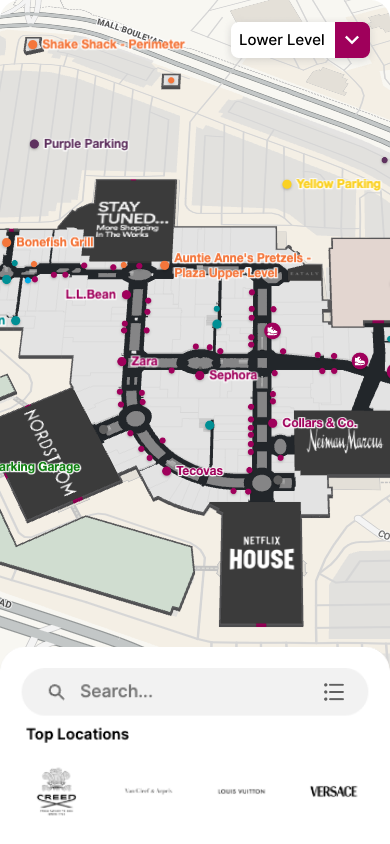
To accommodate many different types of data across different venue types, from stadiums to airports to malls, I designed a flexible grid system that could scale to meet these requirements. Each cell in the grid can grow, shrink, and be repositioned. Modular cards slot into those cells, each one a self-contained component tied to a specific data source or function.
Card types include a venue map, search, category browsing, deals and promotions, transit information, brand logos, and more. Customization happens through composition, choosing which cards to include and how to arrange them, not through redesigning the interface from scratch.
A mall might lead with category browsing and promotions. A stadium prioritizes quick-access buttons for seating, restrooms, and dining. The system handles that variation without breaking.
The grid also unlocked something the previous directory couldn't support well: rich visual content. Venues can now dedicate full cards to tenant advertising, branded promotions, and event marketing at flexible sizes.
Each card type adapts across multiple grid sizes, with 1×1 compact, 1×2 tall, and 2×1 wide shown here as examples. Cards reconfigure rather than scale. Content priority, image cropping, and label placement all shift depending on the size the card occupies, ensuring each variant feels intentional rather than stretched.
Map card
Deals & promotions card


Testing is a crucial part of designing for large screens. Observing people of different heights, abilities, and levels of urgency interact with a 43" to 65"+ display reveals problems that mockups on a monitor never will.
Touch targets need to be large enough for comfortable use at arm's length. The bottom third of the screen is universally reachable; the top is not — especially for children, shorter users, or people in wheelchairs. Every interactive element was sized and positioned with these physical constraints in mind.
With the new grid system, the same organization can now operate multiple venues, each with its own layout, branding, and content priorities. Here, two malls within the same group use entirely different configurations. Different backgrounds, different card arrangements, and different featured content, all without any custom design work.
One problem we encountered with the new system was that not every venue needs a weather feed, movie listings, or rich promotional content. A group of customers told us the full system was more than they needed, and configuring the grid felt like overkill when all they wanted was a clean, straightforward directory for their visitors.
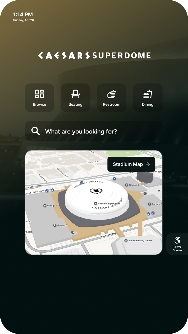
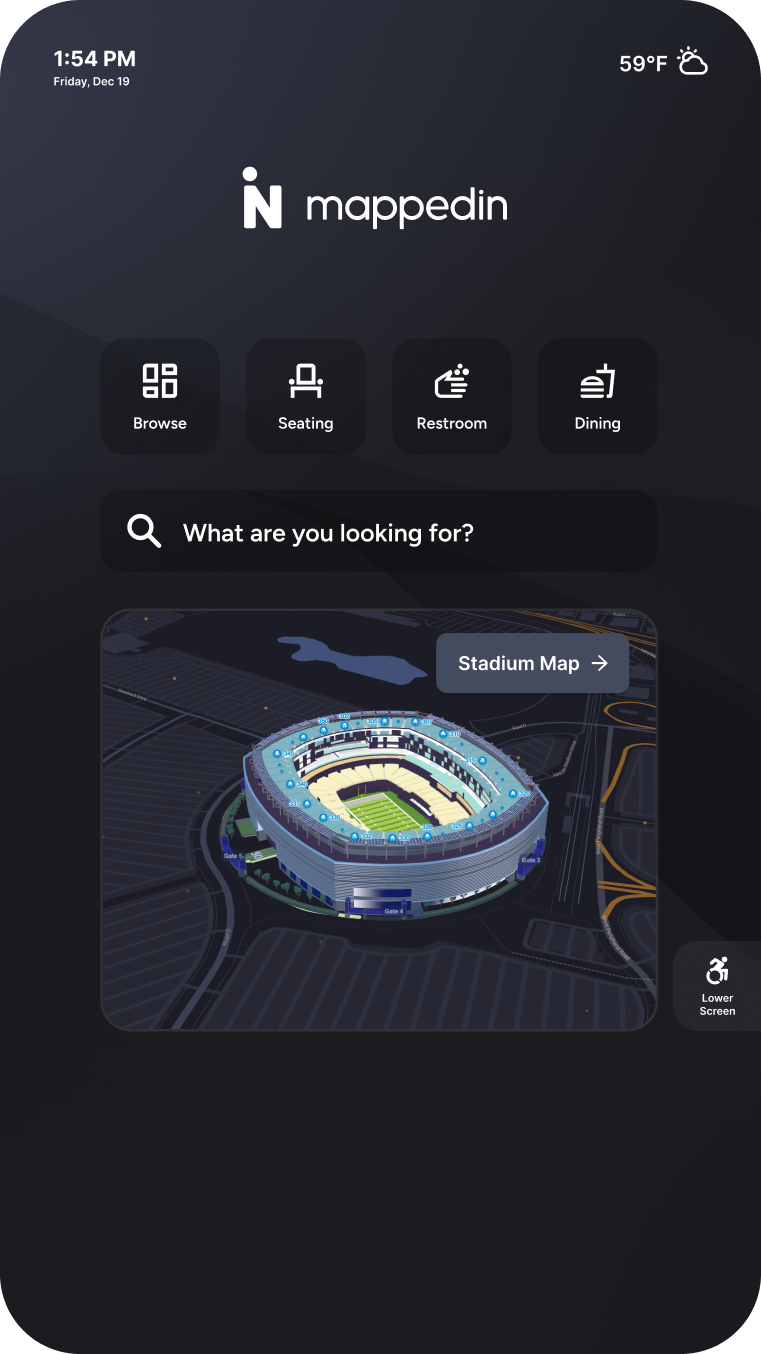
To solve this, I designed a minimal layout that strips the directory down to its essentials: quick-access buttons for the most common destinations, a search bar, and the venue map. It gives visitors everything they need to orient themselves without any noise. For customers, it's simple to deploy and requires almost no configuration.
The flexible grid gave clients something the previous version couldn't: a directory that felt like an extension of their brand, with space for ads, promotions, and event marketing. And for customers who needed something simpler, the minimal layout offered a fast, low-configuration option that still delivered on wayfinding. Across the board, clients went from working within a rigid template to having a system that met them where they were.
Senior Product Designer • 2023 – Present
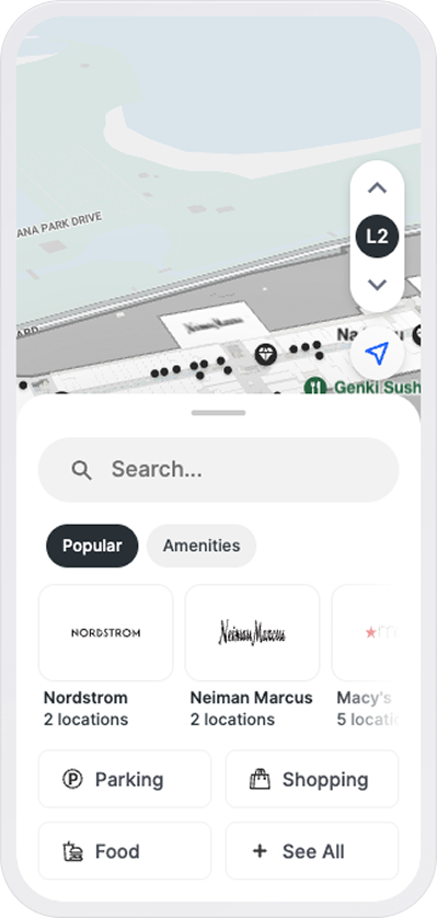
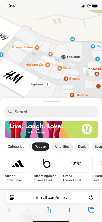
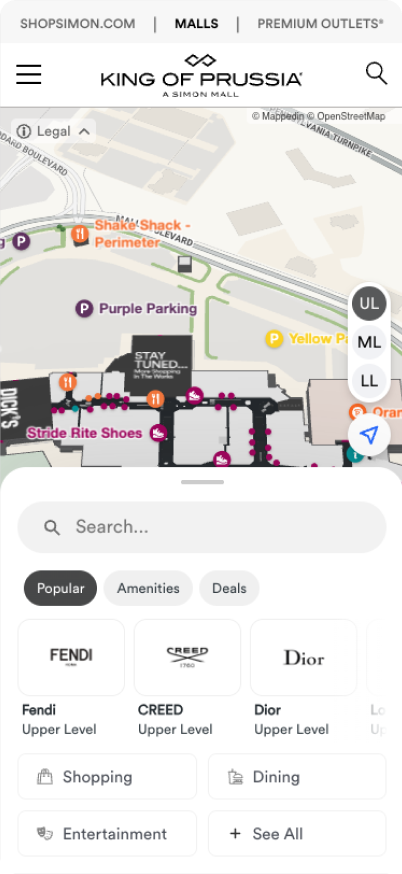
Mappedin Web is a browser-based indoor map for venues like malls, airports, and stadiums. Over the last year I focused on the mall side of it, spending more time with stakeholders and customers to understand the industry. What I learned: the larger organizations pour real resources into promoting deals, events, and the kinds of things that actually pull people to the mall.
Then I looked at our UI and realized we were barely surfacing any of it, and when we did, it was hard to find. That's when I decided we needed to re-architect the home page to surface this information and let people move quickly between it.
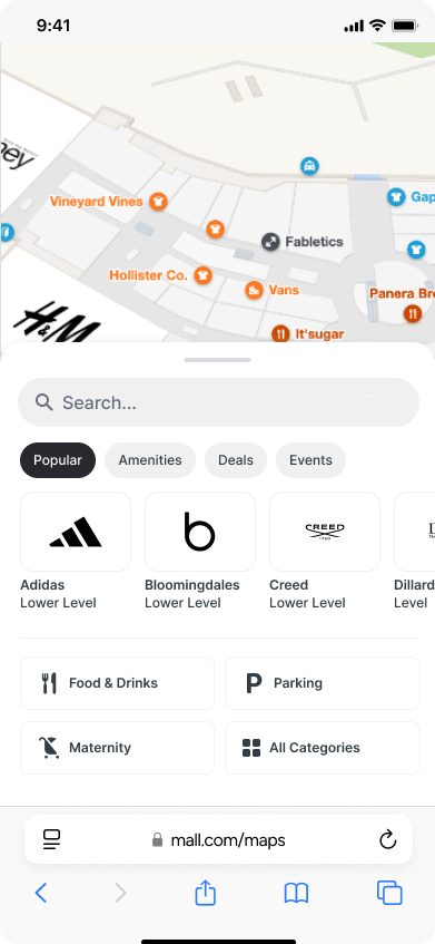
The part I was most excited about: we could tie it back to the map. Clicking "deals" wouldn't just list stores, it would light up every store running one, right there on the map.
A few problems I noticed:
So I stopped treating the experience as just a searchable map and started treating it as a merchandising surface. The stuff malls promote should be one tap from the moment the map loads: popular spots, deals, events, amenities.
 1
2
1
2
 3
3
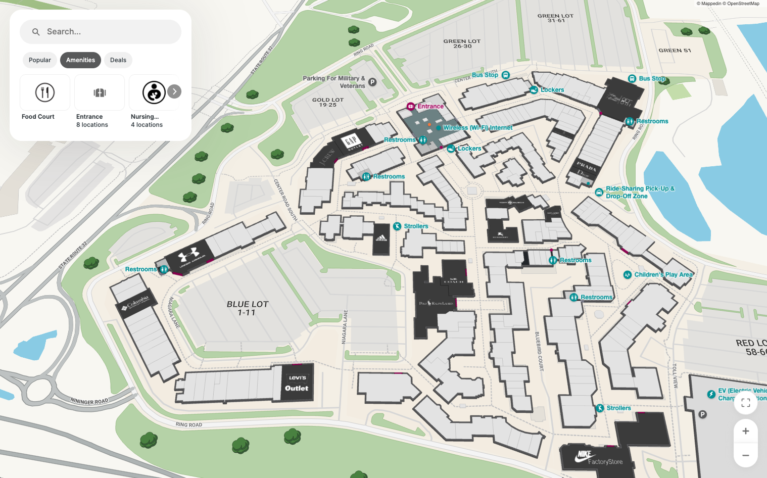
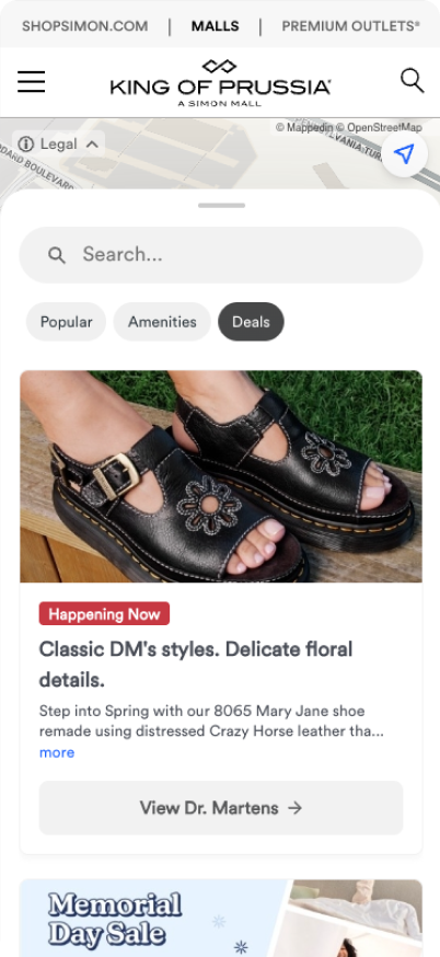
Selecting a tab doesn't just filter a list, it lights up the map. Tap Deals and every store running one highlights at once. Tap Amenities and things like restrooms and parking surface across the venue. The content and the map finally talk to each other.
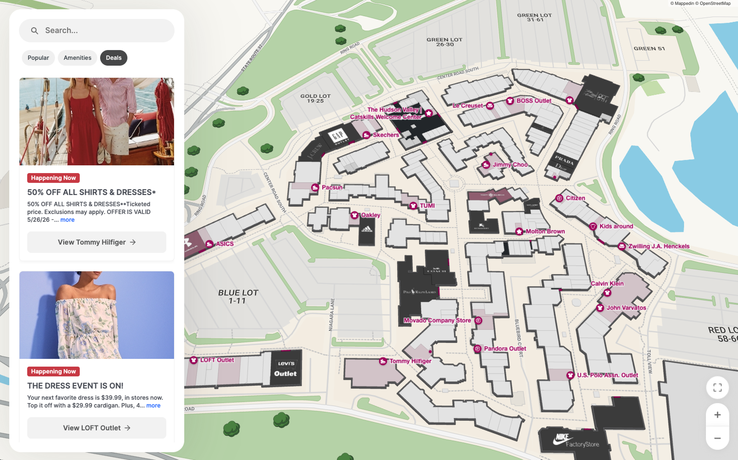
Simon, one of the largest mall operators in the world, rolled the new system out across their properties. They populate the tabs with their own deals and use the featured banner for seasonal events like Christmas and Easter.
Hard analytics are still coming, but the early signal has been strong. One of our largest customers rolled it out across their properties and the feedback has been great. What they invest the most in promoting finally had somewhere to surface.
Mappedin • 2024
A short motion piece I built in After Effects. Most marketing videos are direct and a bit flat, so I wanted to try something more abstract. I used the texture of the stadium screen to slowly reveal the map, giving it some visual interest rather than just stating the product. The idea came to me when Mappedin started pushing into the stadium vertical, and I made it as an option marketing could use.
Motion study • 2025
A small motion study built around what the product actually does. The alert dot blinks, searching, until it catches and turns green. Then the rest of the mark resolves around it: the roofline, the sensor pulse, the wordmark. A quiet way of showing detection instead of just naming it.